Print Design
C Magazine
L A Y O U T | P R I N T D E S I G N | P H O T O E D I T I N G
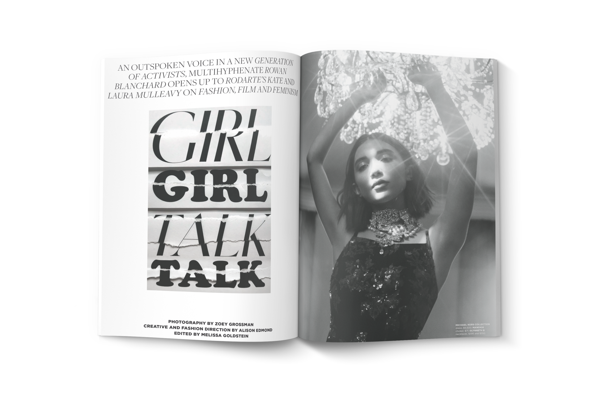
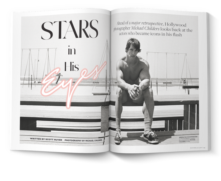
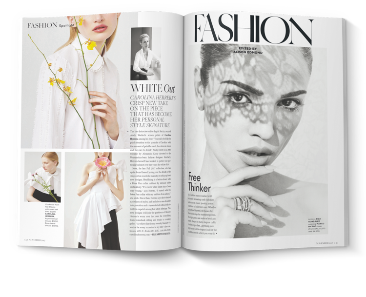
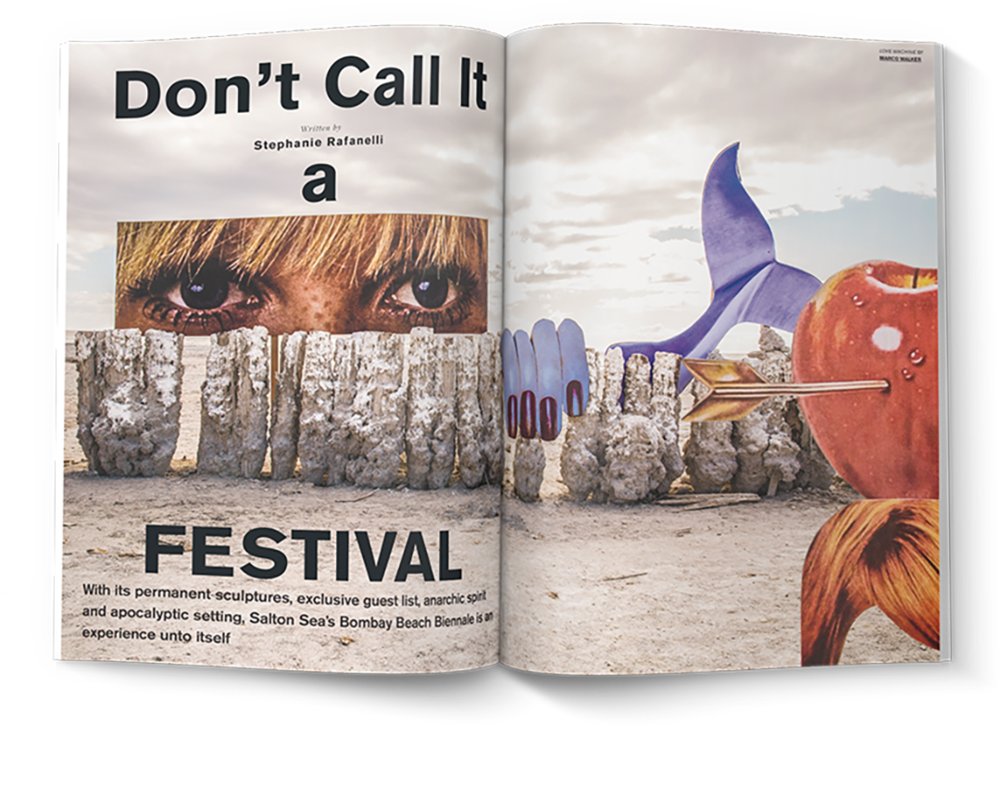
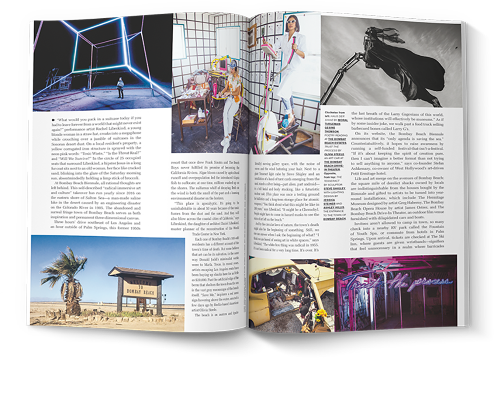
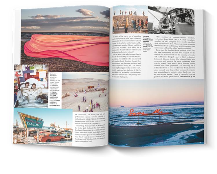
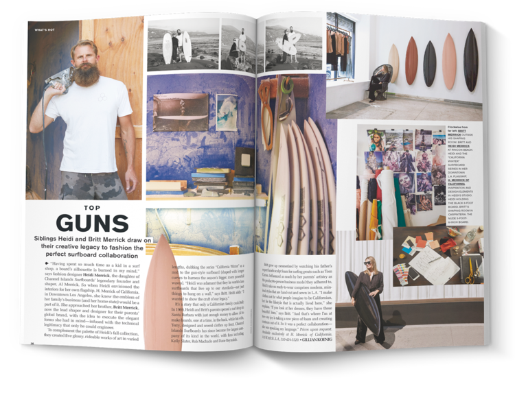
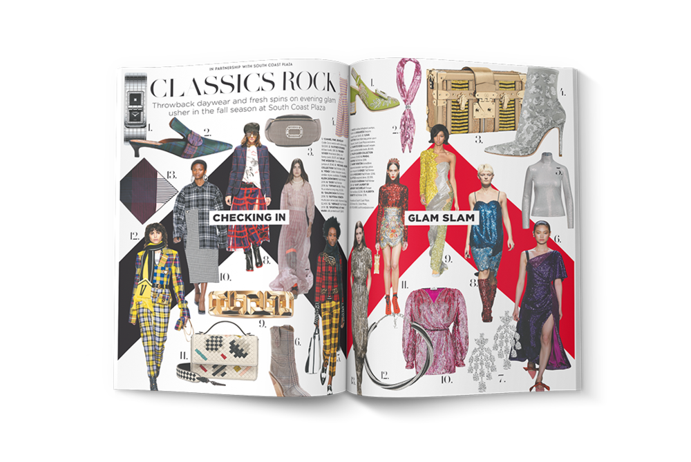
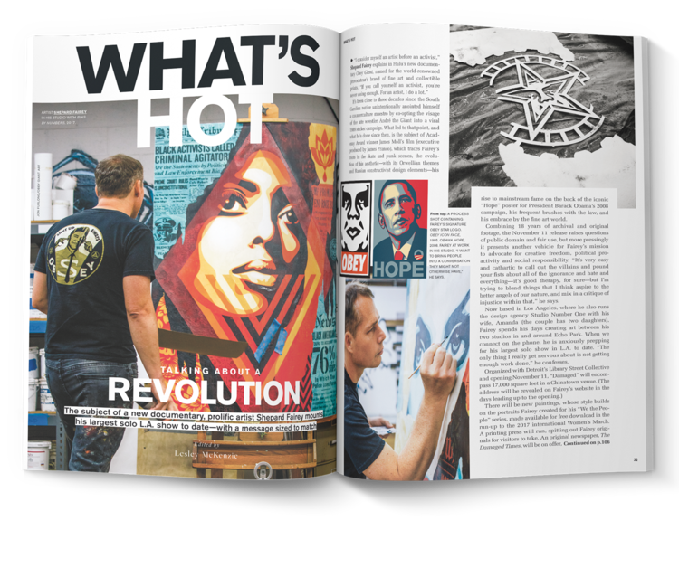
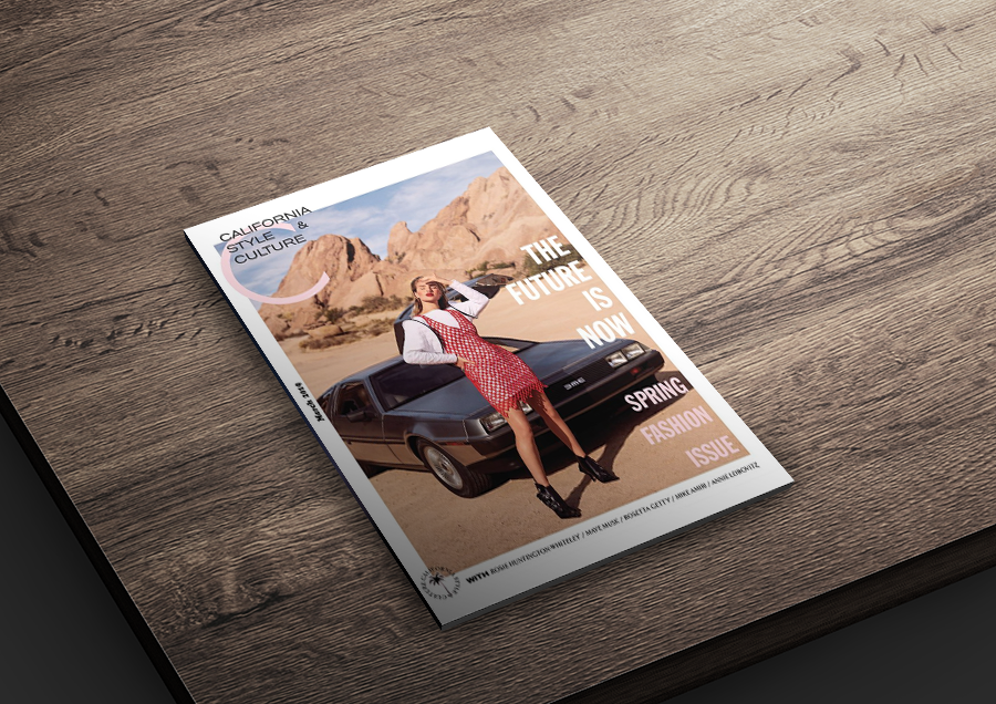
C Magazine’s target audience was high-fashion interested, California-based readers who enjoyed the finer things in life, love pampering themselves, and enjoy other publications such as Vogue, GQ, and Net-A-Porter. I designed layouts, comps, assisted on photoshoots, branding, and social media, keeping in mind an elevated, sleek editorial composition comprised of overlapping images and mixed typography, negative spacing, with minimalist grid layouts.
